Too much discounting? Customers complaining your product is too expensive? Maybe it’s a list price problem, but I’ll bet some money you have a packaging problem too. Don’t build and sell the Cadillac if your customer just wants a Chevrolet.
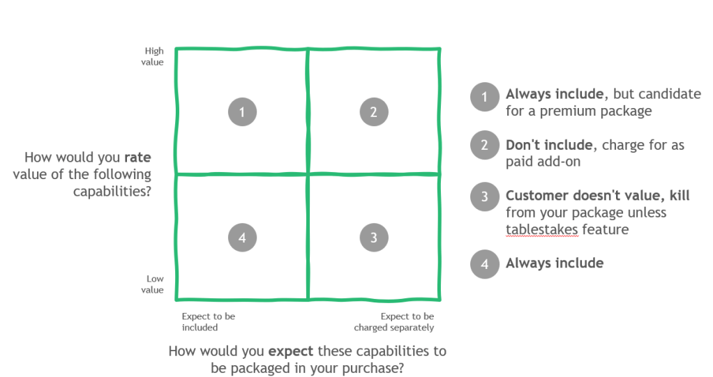
Here’s an easy graph to build of your current or future capabilities to get a better sense of your product’s value packaging health in the eyes of a customer.
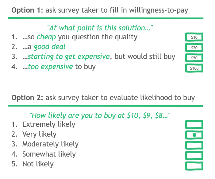
Now here’s the key: after you get customers thinking about value, then ask about price! Here are some simplified ways to ask the question.
This problem is simple enough for a single product. Once you add a second product (for example an edition as you commonly find in B2B SaaS), it is even more critical. Take Salesforce. The company sells Sales cloud in 4 editions (really the bulk of sales are in the top three good-better-best editions) called Essentials, Professional, Enterprise, and Unlimited.
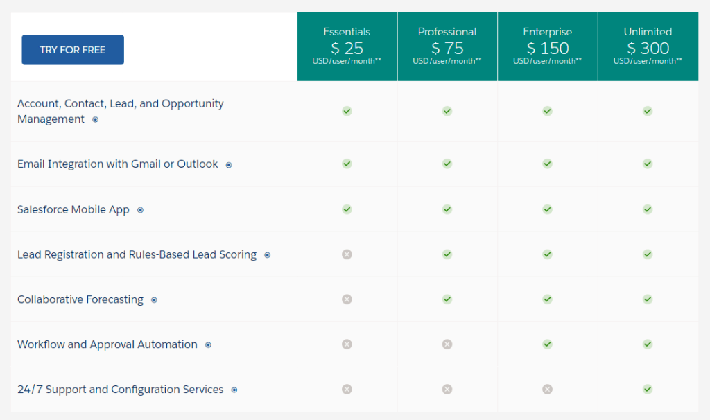
A packaging graph can quickly isolate what customers value and will pay for in Professional that is different from Enterprise. In this case, Salesforce learned that approval automation and workflows are super valuable for Enterprise/Unlimited but not for Essentials/Professional. Using the packaging graph above, approval automation would fall into Quadrant #1 for Enterprise/Unlimited but Quadrant #2 for Essentials/Professional. To bring back an earlier metaphor – Essentials/Professional are the Chevrolets, Enterprise/Unlimited are the Cadillacs.
It’s also quite likely that the pricing research on value created by this feature (among others as you expand the icons) justifies double the price!
Get better at this type of analysis and watch your prices rise to reflect the value customers understand and will pay for. So ask these questions and visualize your packaging graph. It’s a no-regrets way to quickly have a business strategy discussion anchored on data versus anecdotes.
